Canadian Association of Poison Centres and Clinical Toxicology
A cautionary approach to branding. This website was designed to save lives and serve a growing national membership.
The brand. The name.
As we took on the project, CPCCT was in the process of a name change but were also dearly in need of a new branding system. We created one that utilizes the emblematic symbol as the driving force for everything moving forward.
The website.
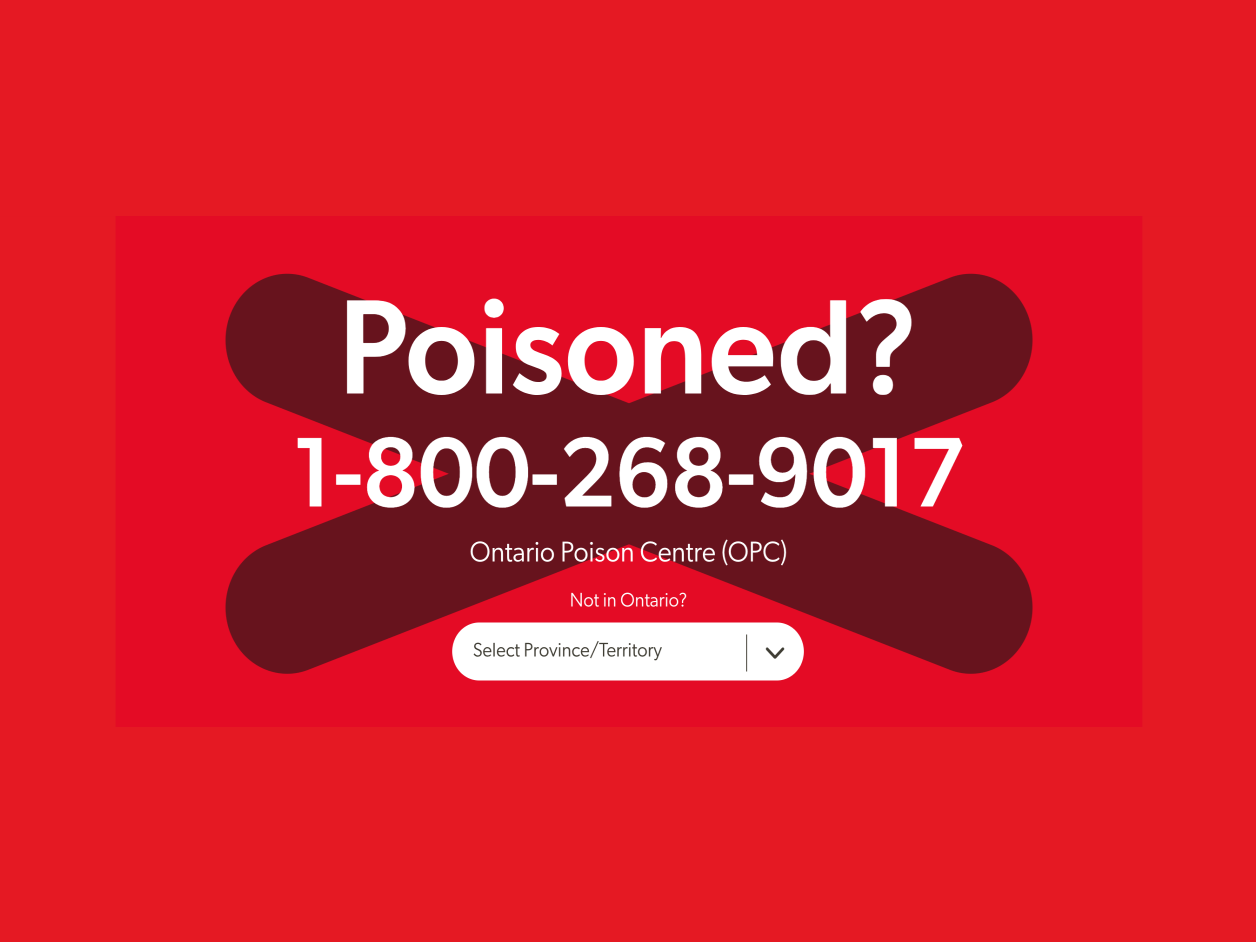
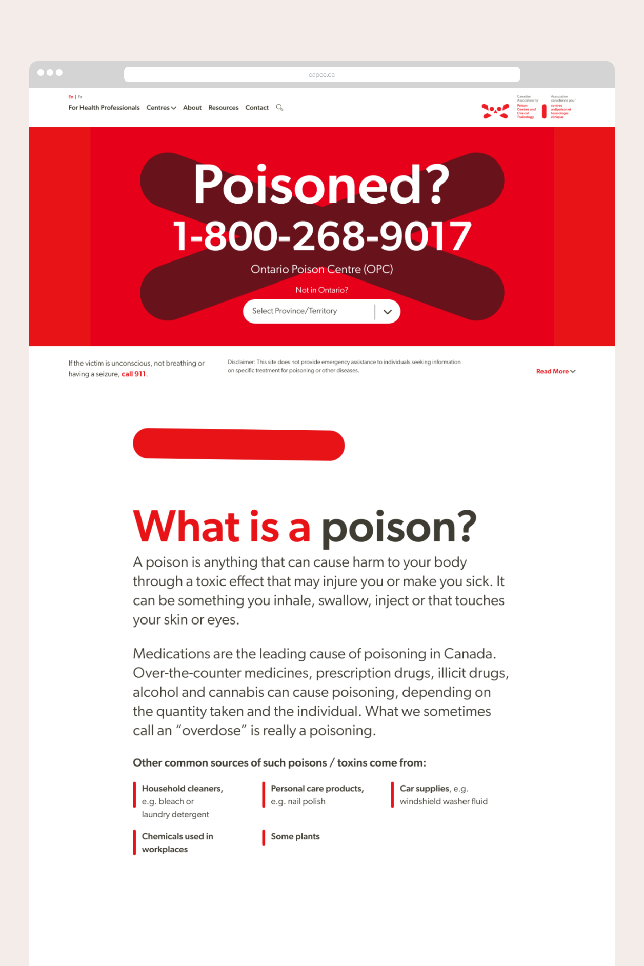
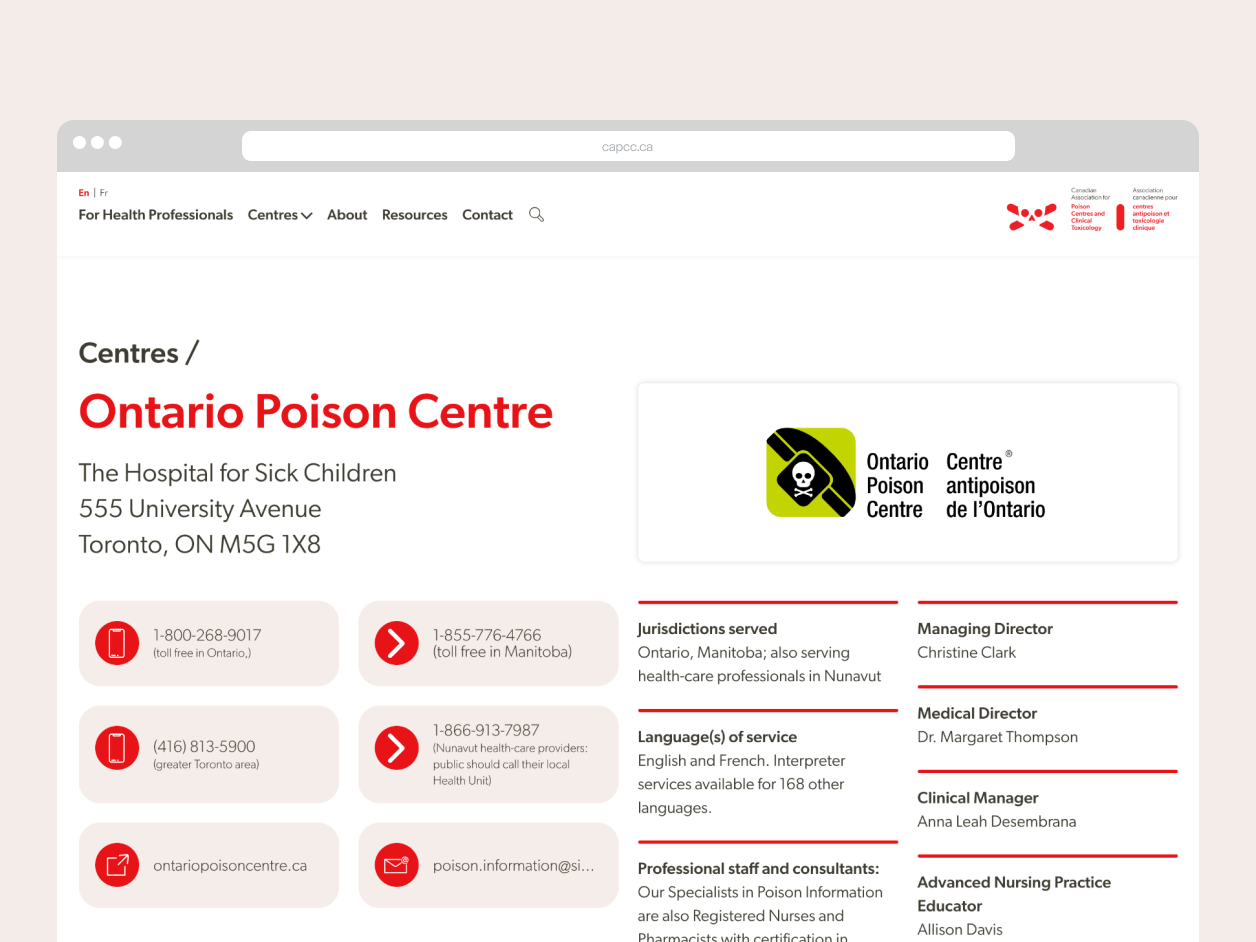
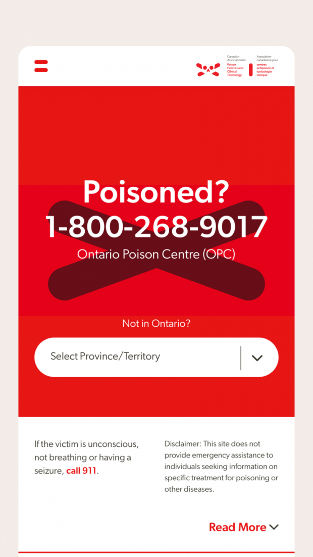
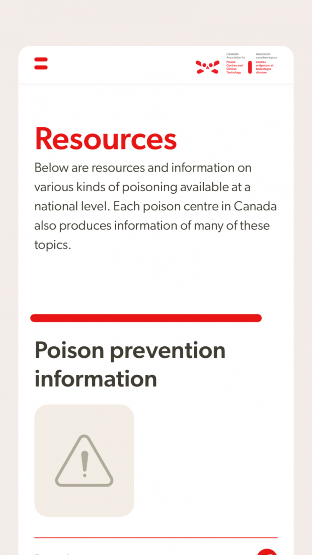
The website serves the general public, health professionals, and members. Most importantly, the first thing the public will find is emergency contact details. From that point on, content is fact-based information and resource materials curated for all users.
The interactive timeline.
We probably had more fun than we should have. This fully content managed timeline was just too nice a feature not to show off.